
Colors Everywhere
Something about the spring flowers and bright sunlight has me thinking about house colors these days. I’ve been taking pictures of homes around town that are particularly striking or have new paint jobs, while also doing a little background research for a client whose home will shortly need a full exterior paint.
I’ve found that many of the houses in the ‘finished’ historic districts are a little tepid in terms of paint colors (how many colors of stone can you have?) while the leading edge will find rainbow hues that are sometimes adventurous and great, sometimes a bit much. A few homes have colors that puzzle me for most of the year, and then suddenly a blooming bush at the front corner pops, and I go “oh, THAT’S what they were thinking!” I love those moments.
Also, I’ve been following along with a blog, Design Seeds, which posts color palettes multiple times a day. Intended to inspire
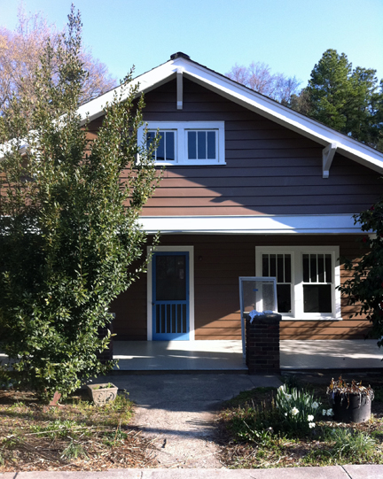
That Door:
recently painted, the blue door is just a lovely pop of color
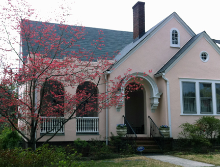
Dogwood
When the dogwood blooms, suddenly the pink makes perfect sense. my camera really coudln’t do it justice.

One of my faves:
one of my recent favorites from Design Seeds. I would love to see this on a little bungalow, with that eggplant color as the accent.
Book a Consult
hi.there@fouroverone.com (919) 339-1411
Office Address: 1235 Berkeley St, Durham, NC, 27705
Mailing Address: P.O. Box 355, Durham NC, 27702