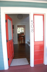
 Whether your house is new or old, color can affect the way you experience it every day – both inside and out. 4/1 offers color consultations as an a la carte service to both residential and commercial projects, and has selected paints for everything from a yoga studio to a tiny, post-war ranch house.
Rules of Thumb
For all paint selections, nothing is better than swatches. After you have an idea of what you’re aiming for, be sure to purchase small amounts of the paint and try it in multiple spots. Everyone always underestimates the difference that exposure and lighting can have on color, and it is much easier to repaint over a swatch than to repaint a room! That said, color is fun, relatively cheap, and easy to change, so don’t be scared to try new things.

Exterior: When selecting exterior colors, three colors are the absolute minimum – and often as many as six can be selected. Most old houses need a color for the siding, a dominant trim color, and a third accent color to pick out architectural details. The front door, porch floor, porch ceiling, and foundation might need to have different colors as well, and should be considered in the entire palette. However, you can use too many colors at once, creating a circus house effect – and it’s not pretty. Also, do consider the colors of the houses near yours: many palettes that look lovely in the store will not be friendly to the bright blue house two doors down, and you don’t want to have the fifth yellow house on the block. (Many examples of colors chosen by 4/1 can be viewed here.)
Remember to take into account other exterior materials when you’re considering colors. Roof shingles, brick foundations, granite steps, or stone pathways leading up to the house can all have an effect on the whole. With some of the wonderful bricks used in the early 20th century, there are greens, purples, greys, and oranges mixed in with a dominant red, and those can be enhanced via the colors chosen for the painted areas. We always recommend leaving unpainted masonry in its natural state – why create a maintenance problem for later? – and prefer to work with the colors and textures found in the brick or stone as it is.


Interior: While looking at a particular, historic palette can be a good starting point, when it comes to interiors it makes more sense to look at the lighting, function, and furnishings in a room than to wed yourself to a period look. Let one room act as a pivot point around which the others can relate, and give some variety to the spaces. In an older home with wide door and window surrounds, stick with one trim color per floor (except for in very unusual situations, it’ll get busy otherwise). And do let there be some contrast between the trim and the wall color – it can be accomplished in the paint finish if you want an all-white room, but white-washing everything in flat paint will make it look like a cheap rental apartment.
Again, color is fun – enjoy the process, look around for inspiration, try some options, and get in touch if you need some help or a nudge out of your comfort zone!

